Other Industries that Inspired Us
Evaluating the risk profile of software is a technically complex task, but there are lots of other industries where consumers have to engage in complex decision-making. Choosing which car is the best choice for you, or which food best fits your diet, or which new refrigerator to buy are all very technically complex decisions, but those industries have all developed (mandatory) labels to help consumers stay informed. We're drawing upon these labels as inspiration for our own reports.
We're going to have future posts that go into more detail on the types of data we collect about software, but here we'll look at broad categories and how they're similar to data captured in the labels from other industries.
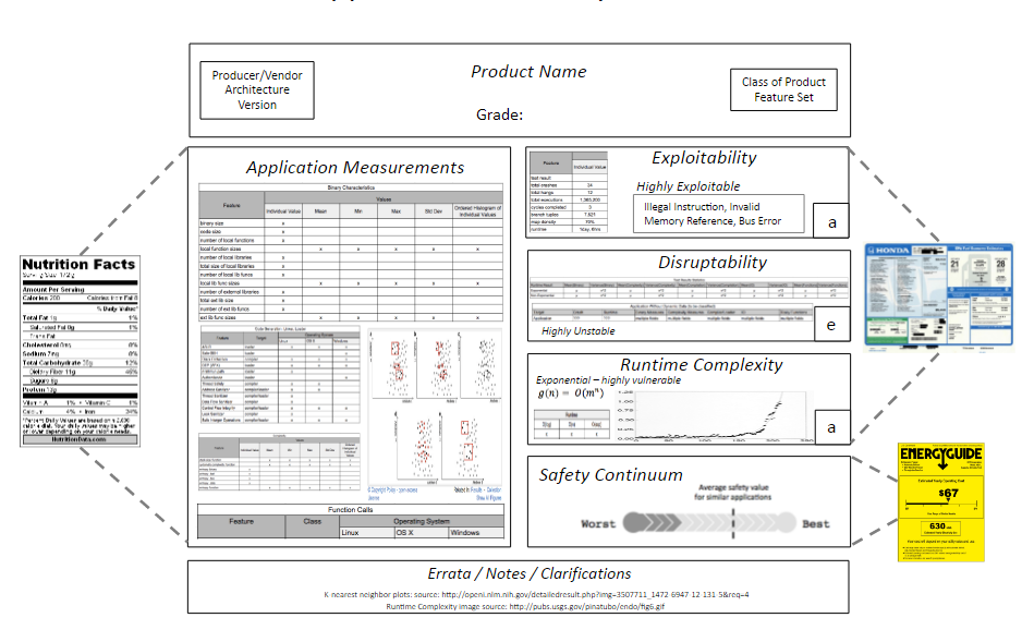
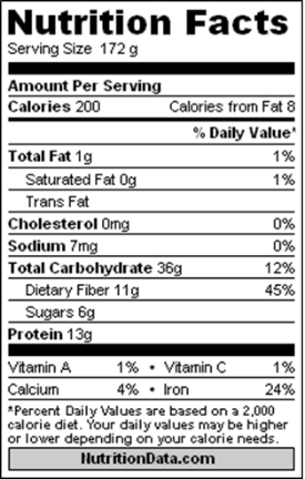
We've already had a post where we compared our approach to nutritional facts labels. The static analysis portion of our data, in particular, can be thought of as the "nutritional facts of software". It's where we talk about what went into making the software, good and bad - what safety features are present, and what things do we see that usually correlate with vulnerable code or risky programming practices. These are things we can determine from inspecting the binary, without running it.
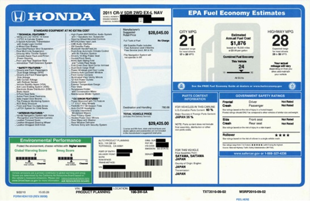
We get our dynamic analysis data, on the other hand, from fuzzing and crash testing the software. This is similar to the crash test, mileage per gallon, and environmental performance data that you find on the Monroney sticker. While you might not be familiar with that name, if you've ever shopped for a new car in the US then you've seen this sticker displayed on all the cars in the dealership showroom. These are all there to provide the buyer with information about the safety and cost of ownership of their prospective new car. Interestingly, some of this data is based on mathematical modeling.
While the crash test data is always based on actually crashing the car, the MPG data is frequently based on what the EPA predicts the MPG will be. They've physically tested enough cars to be confident in predicting how other cars will do, based on other facts about that model.
This is our model for dynamic analysis as well - test enough software samples with actual fuzzing to be able to model and predict with high accuracy what categories and types of crashes we'd see for other software.
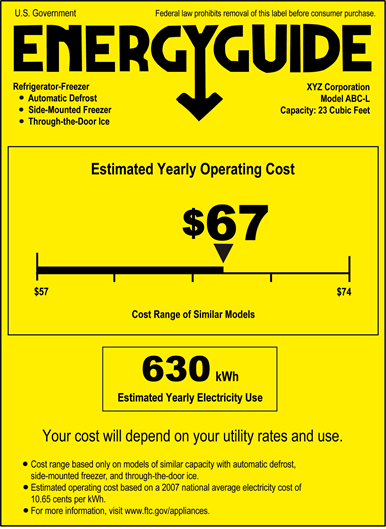
Finally, the Energyguide label is required to be displayed on several types of new appliances. It tells you the operating cost for the device, and puts it on a continuum relative to competing products. Similarly, we'll place software scores onto a safety continuum. This continuum will let you know how a given piece of software did compared to competing products, and compared to overall software in its environment. For example, we'd tell you how Internet Explorer did compared to other Windows browsers such as Edge, Chrome, and Firefox, but also where it falls in the overall spectrum of Windows software.
In the next posts, we'll be going into more detail on these different categories of data, describing what measurements fall into each, and sharing some examples of preliminary data from those groups. All of these categories will play a role in our final, public-facing reports.